Showing posts with label Fashion Design. Show all posts

Saturday, 11 January 2014

little bits of late.


Ordered a gorgeous blue copy of Vladimir Nabokov's Laughter in the Dark, as well as a few other vintage books. Finding time to read a little more, is my aim.


A few christmas treats, blue crystals and pale pink lace bralettes. 


Peach & Ginger tea. 
Pretty tea bags.


Fell in love with this fabric I found. Reminds me of Little House on the Prairie. 


+ Cooped up in the studio as the Ted Baker menswear project deadline approaches... 


Friday, 19 April 2013

Photoshoot for the Bin Liner Boxtop.

Waste Garment Project in partnership with Co-Oproduct.

See more here.

Just a few behind the scenes shots I took of the photoshoot for the garments I made out of melted bin liners... box top with hinge fastenings and scalloped mini.


Above: Shots I took on set
Below: Shots taken by Jamie from Co-Oproduct and Wayne from Life Photographic


Sunday, 14 April 2013

Saturday, 23 March 2013

The Waste Project/ Co-Oproduct.

What is Co-Oproduct?

The other project I've been working on was in partnership with Co-Oproduct; an online platform that focus on creative re-use of everyday waste, where people post Make-It-Yourself tutorials on how to produce new products from raw materials. As part of the project, we were required to make a garment out of waste, influenced by aspects of our trend. (See The Colour Project for our Trend Forecast).

Interpreting the Brief...

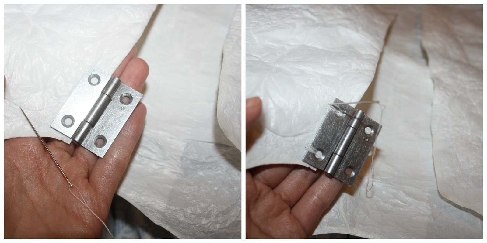
Experimentation: I chose to use white plastic bags because I found that they had alot of potential in terms of the delicate, glossy aesthetic. Using tesco bags and white bin liners, I produced this beautiful leather-like texture. Taking aspects from the trend project, such as the Industrial detailing (curtesy of Paulina Geidrojc) I added steel hinge fastenings to the front of the garment.

I began experimenting by collecting white plastic Tesco bags and bin liners, as I knew I wanted to create a garment that was pure + lucid in colour and more decorative on its surface. I appreciated the potential of the delicate, glossy aesthetic of the plastic, and through layering and ironing the bags, I discovered that the heat produced this beautiful, ruffled, leather-like texture. I then went on to create a garment out of the material, using nothing but an iron to create the fabric, and bond the seams together.

Below: a few shots of the creative processes that went into making the Plastic Bag Box Top. Full DIY tutorial can be found HERE on my Co-Oproduct profile.


Garment Design/ Photography: Jessica Leigh Haughton
Ideas for Industrial Fastenings: Paulina Giedrojc
Model: Chloe Bampton

The piece was a success, as I took my waste products, broke them down and moulded them into a new textile, creating a basic, conventional garment that was completely unrecognisable as a plastic bag. So far developed from it's 'natural', initial state. A garment that incorporated fashion design techniques, but a simple enough construction method that can then be replicated through DIY tutorials, by anyone at home. Sticking to the ethos of Co-oproduct and the essence of sharing creative ideas within a community, I produced my own textile out of waste, creating a garment that is wearable and long-lasting.

The garment was even chosen as one of four out of the year group, to be photographed as part of a professional shoot!

Friday, 22 March 2013

Little brainstorms.

Colour Palette / Sweet Details + Fastenings

So I made a collage in relation to my colour palette of pastels and my theme/concept of childhood. Rainbow cheerios, candy-floss, marshmallow, milkshakes and sprinkles.
Over easter, I want to photograph vintage sweet shops, looking at colours and shapes for palette and details. In terms of experimentation... I want to integrate the technology aspect and colour-graduation detail, through spraying the sweets silver or white. Exploring the sweets as embellishments/ fastenings. Playing around with strawberry laces/ wires and cables.


links to all the images above can be found on my Pinterest + Tumblr.

Wednesday, 20 March 2013

The Colour Project. Change in Direction.

Everything for the Colour Project thus far has been a group effort. Now that our presentation is over and we've completed the trend forecast as a group, the next stage is to continue the project individually, adding other elements of our own.

Concept & Theme

As part of my concept and theme, I will explore the effects of technology on childhood, and how digital media somewhat corrupts personal experience and memory. How virtual simulations have taken over the essence of physical play.

Keywords

Artificial Environments
Digital Simulation
Immersive Interaction
Synthetic Illustions
Computer Generated

vs.

Physical Existence
Senses - to see, hear, taste, touch.
Reality
Self Sufficient Existence 
Memory
Experience

Colour Palette 

Continuing with child-like pastel colours combined with sorbet yellows, peaches and mint greens. Perhaps working in metallics e.g. silver in relation to the theme of technology.

Details & Styling

Looking into dip dying and experimenting with graduation of colour, for example, a bright shade that then fades into white, or paler, duller version of itself. Capturing a graduating effect, starting off bright, vivid and turning into a duller, lifeless tone, expressing the effects of technology on ones experience and memory through graduation of changing colours.

In terms of details, I will look into computerised, electronic inspired fastenings; experimenting with wires, keyboard buttons, plugs, sockets etc.

Silhouette

Embodying the effects of technology in silhouette, as constricting ones senses, for instance, restriction of eye-sight by covering the face/ the sense of touch, by covering the hands. Ultimately creating a shape that expresses the idea that one is suffocated and separated from the real world, being so captivated and consumed in their artificial, digital environments.


Sunday, 10 March 2013

Trend Forecast/ Presentation Prep.


The Colour Project

Trend Forecast

The first part of my second uni project (The Colour Project) is to produce a presentation for our prediction of a trend forecast. Here I explain how the group and I worked together to explore themes/ concepts, as well as look into silhouette, colour palettes and details/styles, to ultimately predict a trend for Spring/Summer 2014.


Theme/ Concepts


Silhouette

Inspired by crystals and minerals; the natural formations within the fragments and shards creating suggestions for silhouettes.

Deriving shapes out of the erosion of elements and the harshness of weathering. Resulting in silhouettes that were angular and asymmetrical.


Colour Palette 

A combination of pastel pinks, blues, deep purples and indigo's, with slices of silver. 
Soft, powered pinks and blues in correlation with childhood, memories and dreams. Within our technological age, a comment on how digital media effects ones experience and memory.
In reference to the universe, the concept of time/space and the speed at which we live. Calming hues of purples and indigo's a suggestion of slowing down. Integrating metallics, highlighting industrialisation and the rate of consumption.


Detailing and Styling

Exploring metallics, with chunky silver fastenings such as bolts, screws, locks etc. Chunky, hard and angular, in reference to Industrialisation, factory-made, speed of consumption.

 The weathered, earthly components that inspired silhouette and colour palette create contrast with the overlaying of pixelated prints. This is where angular, hard details meet the delicate aesthetic.

The grid effect resembles pixelation found within digital media; exploring the idea of order, the concept of us constantly trying to measure and make sense of the natural world around us.

Here's a link to our Presentation...

Trend Forecast - Spring/Summer 2014 - Industrial Skies

Thursday, 7 March 2013

The Colour Project: Further Experimentation.

Just a few shots of the group in studio, experimenting with dye samples and industrial fastenings.


Industrial fastening samples and pastel tie dye samples - Polly Giedrojc
Silhouette drawings - Jessica Haughton
Silhouette 3D development - Jessica Haughton, Polly Geidrojc, Emily Roberts, Kaylah and Amaris.
Photographs - Jessica Haughton

Thursday, 28 February 2013

The Colour Project: Experimentation.

So after today's tutorial with my group, we experimented with some of the samples we all brought in. Together we've come up with a really beautiful colour palette - a combination of pastel pinks, blues, deep purples, indigo's and we want to integrate silver in there too. For Silhouette, we're inspired by crystals and hair, hard and angular intwined with soft and delicate shapes. For detailing, we're thinking industrial inspired fastenings, silver bolts, nails, pins etc. contrasting with the delicate aesthetic. We want to create a capsule collection for Spring/Summer.

Here are few images of us experimenting with colours and printing...


Inspiration for silhouette - crystals and minerals, taking suggestions of silhouette from the shards of glass and different formations... useful in terms of garment length perhaps. Working with the concept of weathering and wearing out. Asymmetrical in structure, top heavy.


The concept of breaking up materials and reforming them. Samples above - Polly Giedrojc


Dye samples and sketchbook work - Emily Roberts


Experimenting with an array of pastel shades.


Delicate, smoke-like imagery on top of gridded paper - in terms of theme - exploring the idea of measuring, the concept of us constantly trying to measure and figure out the natural world around us. Grid sample - Kaylah.


Painting on top of recycled, ironed plastic, printed onto paper... created this beautiful texture that resembles that of skin. Print samples - Jessica Haughton


Print samples - Jessica Haughton